Join Process Revamp: Phase I
There have been some great ideas that have been bouncing around since the Dark Crusade competition and Muz's report a few weeks ago. We want something simpler. We want less text that tends to scare folks away. Phase I is simplifying the Join Form.
Taking the opposing image idea from Marick Arconae, a few of us (Marick, Muz, Raken, Solari, James, and myself) sat down and hammered out a few directions we could take the form. Here's what we're looking at:
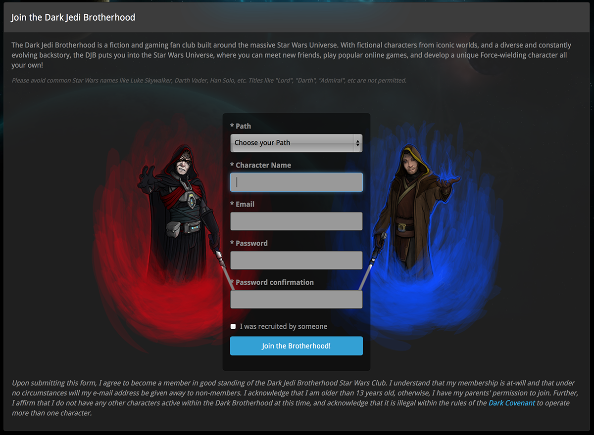
For comparison, here's the current form. The items to note are:
- No massive walls of text.
- Everything has been collapsed into a single set of form fields.
- Order selection is now gone. You select a Path (Light vs Dark) instead.
- The recruitment field has been made less overlook-able (if that is a thing) by changing it to a checkbox. On checking it, it exposes the recruit field.
- Sith/Jedi images. Whee. You may have seen these on the Twitter page or posted on IRC. This is what they were truly drawn for, though.
No "Order" Selection? That's Preposterous!
It is still there - we're just moving the Order selection process into the Test of Lore. Explaining our six Orders seemed a bit silly from the get-go. The less text we shove in someone's face, the more likely it is that they'll fill out that form (at least, that's the hope).
Here's what Order selection will look like in the Test of Lore:
Dark Side Version

Light Side Version
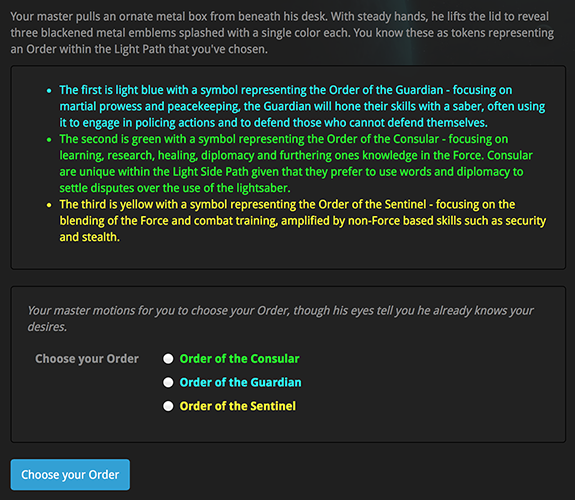
In addition to the Order selection, James did some work to make the whole Test of Lore process accommodate light siders a bit more seamlessly. We do know, however, that there's still a lot to do with the Test of Lore and that'll come in Phase II of the Join Process revamp.
So where does this leave us?
Well, the code for this has been done by James and myself; Solari has blessed the Test of Lore tweaks; and Muz and Raken are on board to move forward.
We want to show you guys what's coming and we'd like some feedback on this piece of Join Process Revamp!
Feedback we have already received from amongst the DC (so you don't need to spend time reiterating):
- Spacing around the form and the size of the images could use some tweaking. (this feedback was from me and I'll make tweaks once this goes live)
- We need less text in the Test of Lore itself. (Muz has plans for this and that's wrapped up into Phase II)
- Mangoes are disgusting. (Trust me, I know)
You need to be logged in to post comments
Yes, spacing is needed around the join form images/fields/text. That'll be coming soon. :D
I like the new join form and how straight-forward it is...I can't comment much on the Test of Lore since I don't think there's a way to really see it right now? I would say to add in some more visual cues along with the text.
What Halc said.
Also, the light blue, yellow, and purple kinda sting my eyes due to the brightness of the text.
Other than that, I'd say it's looking great :D
PS. Will we be seeing the robe the sith wears in the selector? :P
Yeah, I agree. There is a LOT of text on the Test of Lore. Visual cues are key to lessening that weight. Muz has something in the works that'll help on that front. I'm not sure how much he's talked about it so I won't steal his thunder - but you hit the nail on the head for what is planned for the (near) future.
Big fan of that change up Orv.
Concerning the join process, are you guys going to look at implementing some A/B testing protocols before you change up the process too drastically? We say that walls of text are bad, and while I agree in theory, implementing some testable criteria onto the change of the process all the way through might really help lock it down.
Hit me up in email if you want any ideas toward that regard.
Just a quick feedback. Not many people have a master in mind when they join but the form implies both the master being already chosen and that this master is male.
Otherwise, looks excellent. <3
@Lenzar:
From an earlier point in the (temporary) Test of Lore:
Wow, what a change. Love it.
My only issue is the mention of the Dark Covenant in the join form. I understand that little blurb is needed, but can be provide a link to the Covenant in case people are concerned besides the 1 character limit what other rules they will have to follow?
Looks really good Orv, I like what you all have done so far. I know it is far from complete, but it looks way better than what we had before. Keep up the great work.
Fantastic work, this is a big improvement.
The brighter colors...are a bit bright like Kaz said.
Also, mangoes are awesome.
That's a brilliant join page!
I've committed some code that will:
Good thoughts, folks :D
Good Orv, Good. Have a delicious mango
Fantastic work! I would have signed up immediately after seeing this page greeting me - looking great :)
Wow this is a fantastic join page. Excellent work there.
This is amazing!
As a new member I will say this streamlining the join form is a good idea. As a ToR Guild officer I like it because it actually gets the people to think about which guild they want to join, I know that was not its intent but when you are recruiting even on the Imperial side of ToR some people might want to have a lightside decendent of their Imperial who was a lightsider in a bad place type concept. So I like the way its set up.
Looks good to me. I like the idea!
And we're live, ladies and gentlemen!
Woot!
Awesome work, guys. :)
That looks great!
Awesome work. We've needed to improve the join process for a very long time now. I really like the direction it's going.
Love it, love it, love it. Awesome work you guys.
I look forward as well to the extra visual stuff for the Order page that was already mentioned. That sounds very nice too.